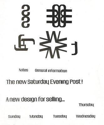
Here are two alphabets that I’ve kept for years. The first was used by the Saturday Evening
Post circulation and marketing folk in 1960.
I only ever saw it used by the Post for house ads in the weekly and
mailing shots and as it is only the basic alphabet (instead of over a
hundred characters in a complete one) I think its use was exclusive to the
Post. As a typeface it’s nothing special, just look
at the caps and numerals but what intrigued me at the time was the rather
unusual lowercase. Because it has quite
short ascenders and desenders (just like the McDonald's logo) it can be stacked
in a multi-decked headline quite tightly, look at: the All-American brands spectacular.
Like most display faces it really doesn’t work for text setting as you can see
in the text blocks below. I wonder if it
was loosely based on Fiedler Gothic designed by Hal Fiedler for Photo-Lettering,
New York in the late Fifties.
The other
alphabet is one I designed in 1967 and was based on the idea of making all the
cap letters as near as possible square.
Sort of a hopeless idea, especially for the I and M. I convinced Paul Bailey, the owner of
Lettergraphics in Los Angeles, to add it to their photosetting collection (the
page is from their type book) and he had the lower case, numbers and
punctuation designed. It’s none too
readable though it could work for a logo using two or three letters. The only time I saw it used was a headline in
Playboy.


No comments:
Post a Comment